By FXMacroData Team
Published on June 7, 2026
FXMacroData now goes beyond raw MCP tool responses with a new app layer built for traders and analysts who need to see the macro picture, not just read rows. Inside compatible AI hosts, you can move from a plain-language prompt to an interactive chart, comparison panel, heatmap, scenario model, or event replay without leaving the conversation.
That matters because macro decisions are usually visual and contextual. A single inflation print or policy rate change rarely tells the whole story by itself. Traders usually want to compare the path, test the spread, inspect the next catalyst, and map the likely implications for a pair like EUR/USD or USD/JPY. MCP Apps make that workflow native.
FXMacroData MCP now supports app-style visual surfaces for indicator charts, pair comparison, macro heatmaps, policy scenarios, war-room workflows, event replay, and quant stress testing inside the same AI session where you ask the question.
What’s New
The new release adds a visual and analytical layer on top of the existing FXMacroData MCP server. Instead of only returning structured payloads, the server can now produce app experiences that help users inspect and interpret macro conditions faster.
- Indicator charts for series such as GDP, inflation, unemployment, and policy rates.
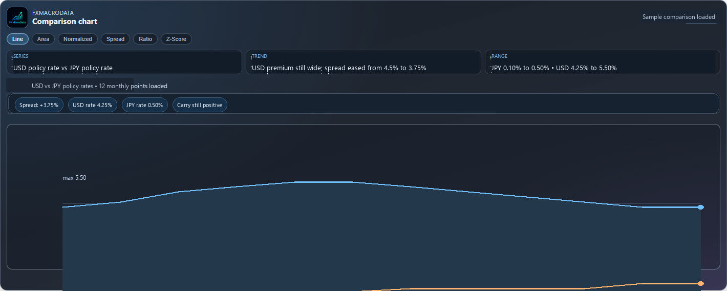
- Comparison charts for spread, ratio, and normalized views across two related macro series.
- Macro heatmaps for scanning multiple currencies and indicators in one view.
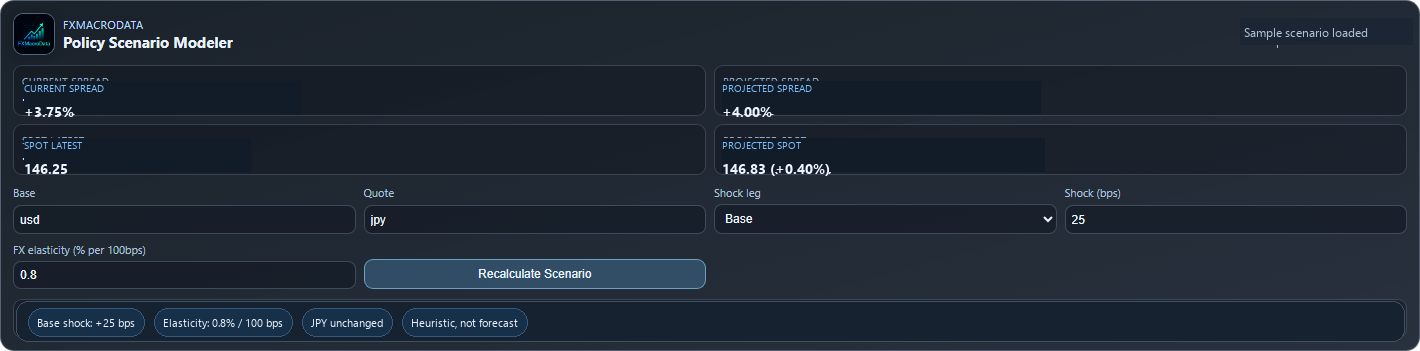
- Scenario tools for testing rate-shock assumptions against FX sensitivity.
- War-room workflows that bring pair context, release queue, and risk notes together.
- Event replay for stepping through how prior releases affected a pair.
- Quant lab views for deterministic stress ranges and distribution-style framing.
Why It Matters for Traders
Traders rarely stop at one question. If the Federal Reserve sounds patient while inflation stalls on the way down, the next question is how the front-end rate path compares with peers. If the Bank of Japan is still lagging the global normalization cycle, the next question is whether the spread still explains spot, or whether positioning has become crowded.
The app layer shortens that loop. Instead of exporting data to another dashboard or notebook, you can stay inside the same client and move from observation to comparison to scenario testing in a few prompts. That is the practical value: fewer context switches, faster judgment, and more structured follow-up.
Check the latest release, chart the relevant macro series, compare the spread behind the pair, run a scenario, then decide whether the market move is confirmed by structure or just reacting to a headline.
Practical Example 1: From USD Inflation Print to a Better EUR/USD Question
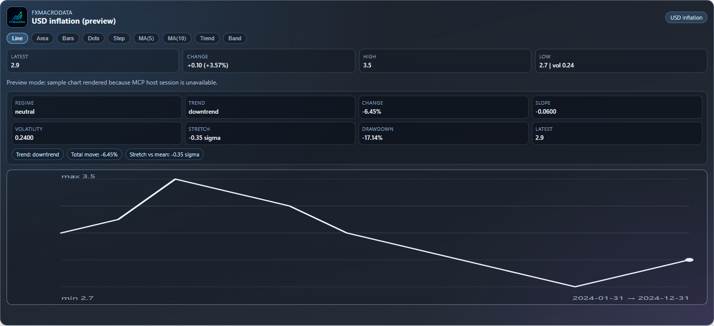
Imagine you are preparing for a major US data week and want to know whether the latest inflation path still justifies a higher-for-longer read on the dollar. The raw series is easy to inspect directly through the API:
curl "https://api.fxmacrodata.com/v1/announcements/usd/inflation?api_key=YOUR_API_KEY"
A representative response might look like this:
{
  "ok": true,
  "status_code": 200,
  "result": {
    "currency": "USD",
    "indicator": "inflation",
    "data": [
      {
        "date": "2026-01-01",
        "val": 3.5,
        "announcement_datetime": "2026-02-12T13:30:00Z"
      },
      {
        "date": "2026-02-01",
        "val": 3.3,
        "announcement_datetime": "2026-03-12T12:30:00Z"
      },
      {
        "date": "2026-03-01",
        "val": 3.0,
        "announcement_datetime": "2026-04-10T12:30:00Z"
      },
      {
        "date": "2026-04-01",
        "val": 2.7,
        "announcement_datetime": "2026-05-13T12:30:00Z"
      },
      {
        "date": "2026-05-01",
        "val": 2.9,
        "announcement_datetime": "2026-06-11T12:30:00Z"
      }
    ]
  }
}
Inside the MCP indicator app, that same series becomes a visual object. You can see the downtrend, the bounce, the range, and the latest stretch in one place. That is a better starting point than just asking whether the latest number was higher or lower.
For a trader, the follow-up question becomes more precise: if inflation is no longer falling cleanly, does the macro picture still support dollar resilience, and is EUR/USD pricing that persistence correctly? The app helps turn a data query into a trading question.
Practical Example 2: Building a Macro War Room Around USD GDP
Now take a more event-driven use case. You are watching the release calendar for a US growth print and want the pair context around it, not just the event timestamp. The first step is still straightforward:
curl "https://api.fxmacrodata.com/v1/calendar/usd?api_key=YOUR_API_KEY"
A plausible trimmed response could look like this:
{
  "ok": true,
  "status_code": 200,
  "result": {
    "currency": "USD",
    "events": [
      {
        "indicator": "gdp",
        "release_name": "Gross Domestic Product QoQ Annualized",
        "release_datetime": "2026-06-25T12:30:00Z",
        "importance": "high",
        "prior": 2.1,
        "consensus": 1.8
      }
    ]
  }
}
With MCP Apps, the next step is not another manual lookup. You can launch a war-room view for the event, bring in pair context for EUR/USD, and then move into replay mode to inspect how prior GDP surprises translated into spot reactions. That keeps the release queue, the pair, and the historical reaction function inside one workflow instead of scattering them across tabs.


The Rest of the App Stack
Some workflows are more about scanning than drilling down. Others are about scenario analysis before the release even happens. That is where the rest of the app set becomes useful.


Together, those views make MCP more than a transport layer. They make it a workflow surface for macro and FX research, which is what many traders actually need once the first data question is answered.
Get Started
If you already use the FXMacroData MCP server, the new app layer is the fastest way to move from a prompt to a usable visual. Connect through the production MCP endpoint, ask for a chart, a comparison, a heatmap, or a replay workflow, and keep the analysis inside the same session.
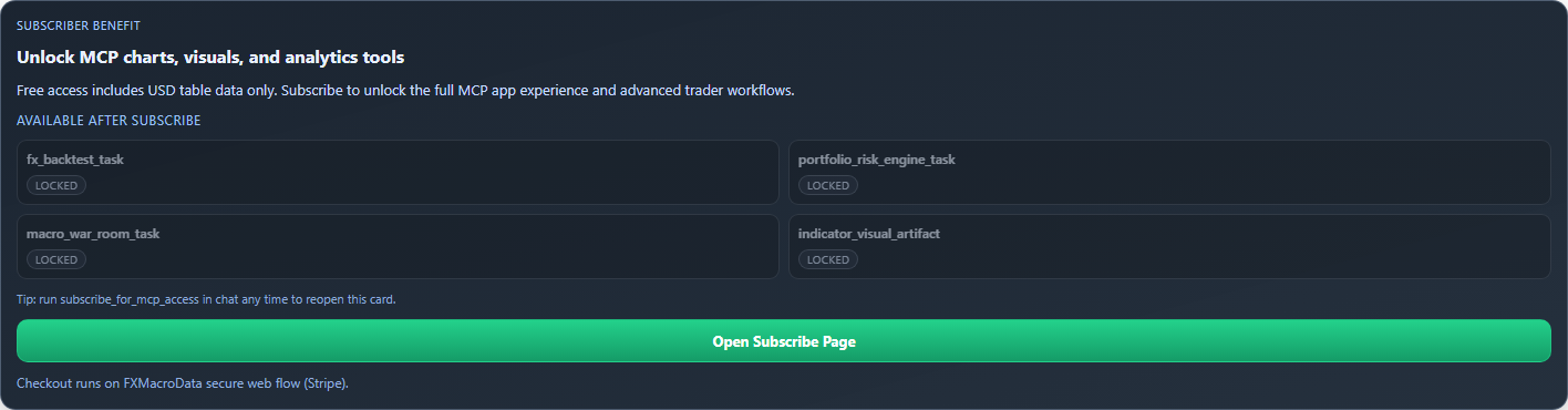
To get started, open the FXMacroData MCP server documentation, then try a simple flow: chart USD inflation, compare it with another macro series, and build a war room around the next USD GDP release. If you want the full visual and analytical app set, the access path is included with paid plans on the subscription page.